Have you ever wondered how to make a presentation that completely captivates and holds the audience's attention? Or, instead, how can you bring information closer to a user so it’s more easily comprehended? First and foremost, you must become acquainted with the fundamental concept of visual perception. This is exactly what this free online Microsoft Excel training aims to accomplish. It begins by outlining the importance of utilizing Excel and debunking some frequent misunderstandings about it. You will learn how to use Excel to organize, filter, and visualize massive volumes of data before moving on to discussing dashboards. The various elements of dashboards such as reports, data, tables, charts, and other interactive components are highlighted in this part of the Microsoft Excel certification.
The concept of visual perception is explained in the following section and brings to light the idea that what we see in the visual world enters our brain and is processed differently depending on the context. You will explore the interactions that occur between the visual world and our brain as well as the psychological reasons why some data visualization strategies work better than others. The need for applying Gestalt Principles during the process of visualizing data is comprehensively covered and you will learn why these principles play a significant role in creating graphics that effectively communicate information. This section of the Microsoft Excel course also covers what preattentive qualities are, the methods of distinguishing information from other data and the difference between data visualization and infographics.
The last section of this Microsoft Excel training course will teach you the procedure for creating customized charts which includes when and how to use dual-axis banding, area chart banding, and limit and bullet charts in data visualization. The last key theme will engage your creative side where you will learn all about the various types of infographics. This part of the course will teach you how infographics help in conveying an existing theme and how it is a key method of storytelling using data and information. You will be taught how to make a progress bar, doughnut, waffle chart, and various other data visualization tools such as the camera tool. Enrolling in this Microsoft Excel course will help you as a data analytics or data science professional in distilling complex data into more consumable information and will also be of great use if you are in business administration, finance or any related field that requires data processing.
What You Will Learn In This Free Course
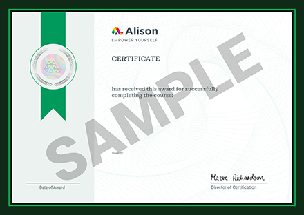
View All Learning Outcomes View Less All Alison courses are free to enrol study and complete. To successfully complete this course and become an Alison Graduate, you need to achieve 80% or higher in each course assessment. Once you have completed this course, you have the option to acquire an official , which is a great way to share your achievement with the world.
Your Alison is:
- Ideal for sharing with potential employers
- Great for your CV, professional social media profiles and job applications.
- An indication of your commitment to continuously learn, upskill & achieve high results.
- An incentive for you to continue empowering yourself through lifelong learning.
Alison offers 3 types of s for completed courses:
- Digital : a downloadable in PDF format immediately available to you when you complete your purchase.
- : a physical version of your officially branded and security-marked
All s are available to purchase through the Alison Shop. For more information on purchasing Alison , please visit our FAQs. If you decide not to purchase your Alison , you can still demonstrate your achievement by sharing your Learner Record or Learner Achievement Verification, both of which are accessible from your Account Settings.


 Avg Hours
 CPD Accredited
 Total XP:
 Knowledge & Skills You Will Learn


